Thought shared by a friend:
When you don't have energy to do something creative in the studio, do something routine. Cut mats, prepare canvas, and such. Move forward.
Today I prepared canvas. Thought about clearing a wall for pre-gallery selection and staging of paintings.
Wednesday, March 31, 2010
Tuesday, March 30, 2010
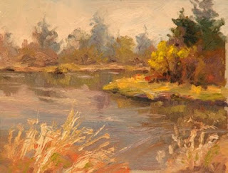
THE LIVING RIVER
This month, I'll have a painting featured in THE LIVING RIVER juried art exhibit.
This is a benefit for the Mckenzie River Trust.
Jacobs Gallery
110 West Broadway
Eugene, OR 97401
For more information:
http://mckenzieriver.org/the-living-river-art-exhibit
This is a benefit for the Mckenzie River Trust.
Jacobs Gallery
110 West Broadway
Eugene, OR 97401
For more information:
http://mckenzieriver.org/the-living-river-art-exhibit
SPRING TREES, FALL GROUND
Trees are budding out, but the ground is still full of dried grasses, bushes full of seeds saved over from last fall for the birds. Spring is just a hint of green, more red than green. And yet, the sun-warmed pond is alive with ducks, geese, (snakes), and tadpoles.
Monday, March 29, 2010
BOOK REVIEW: GEORGE BELLOWS by Mary Sayre Haverstock
Book Review: GEORGE BELLOWS by Mary Sayre Haverstock.
(Merrell, 2007)
This artist’s biography is the most beautifully illustrated and presented book I’ve seen in years. The color images are rich with color and look as if they represent the artist’s paintings superbly. The story of Bellows’ life is engaging. Even more interesting are the shockingly honest portraits dotted throughout the book. There are also some elegant portraits, and I kept speculating that those in particular must have been commissions, in which the sitter had to be pleased with the results.
Probably the most characteristic of Bellows’ paintings are the boxing ring paintings, straining muscles recorded in paint. It’s hard to imagine how all that action could be captured with a painter’s painstaking brushwork.
A beautiful book, with pleasurable reading and thought-provoking paintings.
GREENWAY PARK WETLANDS

Greenway Park Wetlands
I join the paint-out group (had to wrestle car from husband to get there) at the wetland area parking lot. There we all find spots to paint the budding trees across the pond. It is a beautiful day with sunshine and colorful atmosphere, and a welcome break from spring rains. This is my first outing of the year en plein air (as opposed to en plein car and en plein window.) Lots of people show up, including a bunch of pastel artists I haven’t seen in a while. I spend about two hours painting and four hours visiting. We talk equipment (obligatory), painting grounds, drying aids, and travel tips.

I also visit the other side of the lake, via a swampy path, feeling thankful for my boots. I also feel thankful for my boots as I encounter several snakes. One, a nondescript black rope, hurdles fallen logs at a breakneck slither. Another, with beautiful orange diamonds on its side, heads straight for the water, hanging out there with its nose on the surface and tail submerged. I think it is probably California Redsided Garter snake, the first link, but it could be many of these:
http://www.google.com/imgres?imgurl=http://www.californiaherps.com/snakes/images/tsinfernalisma604.jpg&imgrefurl=http://www.californiaherps.com/snakes/pages/t.s.infernalis.html&h=650&w=912&sz=295&tbnid=6b4zaF3UogkkCM:&tbnh=105&tbnw=147&prev=/images%3Fq%3Dthamnophis%2Bsirtalis%2Binfernalis&hl=en&usg=__qLJcoSCYoCJ4dv4w7EWs_WVUyvA=&ei=uaquS8r_JKW4tgOxw-Qw&sa=X&oi=image_result&resnum=3&ct=image&ved=0CA8Q9QEwAg
http://www.uoregon.edu/~titus/herp/sirtalis.html

Sunday, March 28, 2010
SUNRISE SWIRLS

The boat ramp is busy today. It must be the start of some Salmon run. Boat trailers fill half the parking lot, and it is only 6:30. The fishermen passing by probably wonder what I’m doing, with my van door open and my easel just outside. I wish the van had an awning. But then it would almost be a camper–yech.
Saturday, March 27, 2010
SUNRISE THROUGH TREES
 I drag myself out of bed for a spring sunrise that keeps getting earlier. Soon it will be daylight savings time, but for now, I have to get up earlier than I would like. The sky is already getting light through the trees. Instead of driving to the river, I set up in my bedroom looking out through the trees in our back yard. Once the leaves are on the trees, I won’t be able to do this, so I might as well take advantage of the view today.
Paints and palette sit on the bookshelf. I am standing on bedroom carpet. This is just wrong. I am filled with worry that I’ll drop a paintbrush. Trees painted over the sky colors seem wobbly. I feel awkward and out of place. It really doesn’t take very long to get to the river. Might be worth it next time.
But after I finish the painting, I slip back into bed.
Friday, March 26, 2010
MAGNOLIA

The backyard is a busy, elaborate place, full of trees and flowers and changing shadows. It’s always a challenge to predict where the sun will swing and how it will affect the view. I choose the star magnolia as my focus, knowing that it will be in full sun within an hour.
The grass is a vivid spring green. Everything is intensely green. This is going to be a really green painting. Maybe that’s okay. It’s refreshing after the browns of winter.
Thursday, March 25, 2010
LAWNS
 My childhood recollections of Pennsylvania winters are of perpetual gray skies and brown lawns. I have come to visit my mother in Pittsburgh. It is March, but still winter. Patches of gravel-dirty snow dot the ground and heap the parking lots. It’s above freezing, but after the late balmy weather in Portland I am COLD. After several days of gray, the sky finally clears. I find a window with a glimpse of greenery, and paint the hope of spring.
VALLEY SPRING
 I am delivering a painting to Eugene for THE LIVING RIVER, a juried show to benefit the McKenzie River Trust. Different rivers down here, and I ought to be able to find a spot along the McKenzie River to paint. The threatened rain clouds are breaking up, presenting me with lovely, varied clouds to paint. I deliver my painting, then miss the riverside exit somehow. So I stop in the lower Willamette valley. The clouds are warm, billowy, ever-changing. I would be content painting just the clouds. Almost reluctantly, I balance the sky masses with a group of trees, and add some of the spring almost-greenery. A nice change of scene from my usual haunts, and a nice way to break up the drive.
Wednesday, March 24, 2010
SUNRIVER MUSIC FESTIVAL
This year, I was invited to paint the poster for the Sunriver Music Festival. You can check it out on their web site:
http://www.sunrivermusic.org/
http://www.sunrivermusic.org/
Tuesday, March 23, 2010
GRUPPE ON COLOR, 11
Gruppe
“BASIC PRINCIPLES OF COLOR IN NATURE
“When you work outdoors, you only need to worry about a few basic concepts. 1. The nature of the eye, 2. The local color of the object 3. The color of outdoor light, 4. The color of the atmosphere itself, and 5. The effect of neighboring colors on one another.”
Wow! A lot packed into that. Probably, when he mentions the nature of the eye, he is talking about cones, creating colors with bias, and keeping the eye moving. 2-5 seem to speak about the influences that affect the appearance of color. Light, atmosphere, and reflected light all alter the appearance of local color to some degree. But why do we have to worry about all that? Isn’t observation our best guide to what colors are in our complex and changing environment? I’d be surprised if Gruppe meant artists to paint by rule rather than observation, and I saw no sign of the approach of rule in his book. Perhaps he just means us to be aware that all of these factors are present when we observe colors.
Monday, March 22, 2010
GRUPPE ON COLOR, 10
Gruppe
“A NATURAL WAY TO SEE
When I tell you to look all over a scene in order to see color, I’m not giving you a professional “trick”. Think for a minute: how do you normally look at the world? You see color because you move your eyes, constantly giving them new objects and colors to look at. The cones are always stimulated. Staring at a spot–something you habitually do when you draw or paint-is an unnatural way of looking. So when you stare and paint, you lose the sparkle that comes with a casual glance. Train yourself to keep your eyes moving, to compare area with area–and you’ll find that there are no nondescript colors in nature.”
This bit is confusing. While I agree that natural seeing involve movement of the eye, and I agree that it is easier to see color when moving the eye, I believe that there is a difference between natural seeing and the way that an artist looks for color. It has something to do with the way the brain shifts from seeing trees and grass to seeing color shapes. So, while the cones may be more stimulated by keeping the eye moving, the artist still needs to be seeing things flatly, in terms of color and shape, and not allowing the brain to interpret objects. You need to be in artist’s mind.
Sunday, March 21, 2010
GRUPPE ON COLOR, 9
EYE FATIGUE
You might think that the best way to analyze an area of color is to stare at it intently.. But that’s just the wrong way to do it. The longer you stare at an area, the grayer it gets. Your eye becomes used to the color. It fatigues; your sense of color dies. The only way to judge the color of an object is to compare it with the color of objects near it.
"Let’s say, for example, that you want to determine the color of the sky at the horizon. It can be anything from purple to green. But to see it, you should first look over your head for a few second s at the color of the zenith. Then quickly lower your eyes. For a few seconds, you’ll see vivid color near the horizon. Then the color will rapidly fade. If you want to get the character of that day, you should paint the horizon as you see it for those few seconds. That’s why I constantly move my eyes over a scene, comparing values and colors. If I’m stumped by an area, I work on another spot; then, when I turn back to the trouble-some place, I’m usually able to see the color."
What can I say about these words of wisdom? Keep the eye moving. It really works. The more I practice this, the more it helps.
Saturday, March 20, 2010
GRUPPE ON COLOR, 8
Gruppe
“If I am stumped by an area, I work on another spot; then, when I turn back to the trouble-some place, I’m usually able to see color.”
This speaks to eye fatigue. That is, the tendency of the rods and cones to need some time to recover. Generally, the recovery time is seconds, but I suppose that if you are painting an area of gray sky and it starts to look grayer and grayer, moving to some other area would help refresh the eye. Even more, it would let you think about something different for a while, which is helpful in any context when you are stuck.
Friday, March 19, 2010
GRUPPE ON COLOR, 7
Gruppe:
“You might think that the best way to analyze an area of color is to stare at it intently. But that’s just the wrong way to do it. The longer you stare at an area, the grayer it gets. Your eye becomes used to the color; it fatigues, your sense of color dies. The only way to judge the color of an object is to compare it with the color of objects near it.”
This is one of those passages that continues to yield new meaning with every reading. Lately I’ve been looking closely at color fields, those large areas of color that at first appear the same, but reward further looking with variations. A large meadow, the sky, a road, a group of trees. The idea of not staring, but keeping the eye moving is very helpful. As you move your eye across the wall in a room, you begin to notice differences in the color as you move across the color field.
Another way to interpret this passage is to consider a color in comparison to things around it, rather than within itself. Thus, how light or dark something is depends on what’s around it. Colors can be compared to one another, giving more clarity to exactly what kind of blue is in the sky or what gray on the trunk of a tree. Here in the Pacific Northwest, we have to watch out or our paintings will be 80 percent green. Comparing greens, however, gives us a multiplicity of colors.
Thursday, March 18, 2010
GRUPPE ON COLOR, 6
Gruppe:
"One of the first things I discovered was that the amount of color you see is a result not so much of what you look at--but of how you look at it. To help you understandthe idea, we should first examin how the eye operates.
"The eye sees through color cones. It has three sets of cones: one for red, one for blue, and one for yellow. From these colors, it creates everything you see in the world. For the eye to be excited and stimulated--and for pictures to have snap, the viewer should see a bias toward the red, blue, or yellow in your color. The eye should be able to dissect the colors. That is one reason black and the earth colors have little effect on the eye. Black, for example, is opaque. It's just a black and the eye can't decipher it, can't break it into recognizeable color parts."
Gruppe here is probably projecting his own explanation for the observations he has made in his painting. M perspective, based on my research into how the eye works, is that the eye is indeed much more stimulated when there is a bias in a color toward red, yellow, or blue. But this has more to do with how the brain interprets stimuli from the cones. Cones are connected in groups to the nerve cells behind the retina in such a way that the eye/brain is always making comparisons rather than measuring absolute levels of color. The brain also is more interested in variations and change in the environment. so a flat field of color is less interesting than a varied one, and a color with no bias toward red, blue, or yellow is equally stimulating to all the cones, therefore less interesting to the eye/brain. Because research is continually turning up new information, even this perspective may be outdated. But the useful part is: stimulate the eye/brain. Creat variation. Create colors that have bias.
Black may still be useful for creating contrast with another color. Black is also useful when the entertainment of the design is not in color, but in shape. Earth colors can be useful as long as they are varied and not used straight out of the tube.
Wednesday, March 17, 2010
GRUPPE ON COLOR, 5
Gruppe
"Often you must sacrifice one set of relationships in order to emphasize another more essential one."
This speaks to the limitations of paint when expressing the varied and wide-ranging world of light. If you have nine values in which to express the world, you will need to simplify the complexity of what you see. Otherwise, you will run out of values. If the lightest color you have to express a light source is light yellow, then all other yellows must be subordinated to that one, or the light source won't appear to be light.
There's another aspect to the expression of relationships. Our brains are attracted to variety and contrast. If all relationships are expressed with equal emphasis, the painting that results is one of scattered interest. If essential relationships are expressed clearly and others are subordinated, then the painting shines with expression of the artist's intention.
It is useful, in either case, to know what your painting is about.
Tuesday, March 16, 2010
REVIEW: The Artist's Reality: Philosophies of Art, by Mark Rothko
REVIEW: The Artist’s Reality: Philosophies of Art, by Mark Rothko
This small, dense book is an interesting historical perspective, both in that Rothko views the artist’s place historically, and in the historic turning of art away from realism during Rothko’s lifetime. Rothko sees the artist as a sort of philosopher, an interpreter of the sensibilities of his time and life experience. He talks about the shifting attentions of artists throughout history, from the art of myth, to sensual art, to art of emotion expressed in light. We are left to speculate how he might have reflected on the abstracted forms of art prevalent in his later years, after the book was written.
Rothko’s prose is heavy, laden with undefined terms. Even when he does pause to define his language, his meaning is often unclear, as with his oft-used “plasticity.” A significant work of philosophy would require, I think, more exacting language.
An interesting glimpse into the mind of an artist at a crossroads.
Monday, March 15, 2010
GRUPPE ON COLOR, 4
Gruppe
"When painting light trees like birches, don't darken the sky too much to show them up."
It would be pretty easy to overemphasize these contrasts. Along the Boise River, I notice that, while the trunks of the birches in sunlight arewhite, in shade they are darker, and the branches against the sky are significantly dark. The key here seems to be to observe the relationships, and not to exaggerate them out of proportion.
Sunday, March 14, 2010
REVIEW: Edward Seago, by Ron Ranson
REVIEW: Edward Seago, by Ron Ranson
My favorite sort of artist biography: a bit on the artist’s life and perspective so I understand what I’m looking at, followed by lots and lots of high-quality color plates. Seago’s subtle paintings reward lengthy looking. His compositions are spare, neatly balanced, with exacting attention to values. He makes great use of balancing compositions, counterchange, and precise placement of a bit of more saturated color, leaving no question about what interests him in a scene.
These paintings are particularly interesting for me, because, while I enjoy and admire the subtle, grayed paintings, I find that I am emotionally drawn to those with more color in them. Value and composition make the paintings great. But color is what engages my heart.
Still, I am drawn to look at these paintings over and over. A lovely book to add to a collection.
Saturday, March 13, 2010
TURNING FORM WITH COLOR


Friday, March 12, 2010
BOISE RIVER

A classroom demonstration. This scene is, believe it or not, in downtown Boise. The river is in incredibly natural condition, and a trail follows alongside, where you can walk, bicycle, and sometimes even ski. One of the prettiest downtown parks I've ever seen. This was a cold winter day, and I was on a search for some color.
Thursday, March 11, 2010
COLOR FIELDS

4 ways to view and paint color fields; portraits of a section of ceiling at LOAD:
Top left: Match the color mixing with a painting knife and lay it on the canvas in the general area it fills. You can keep it simple as in the example, or narrow the areas down to tiny spots.
Top Right: Fill the whole shape with a color to represent the general color of the field. Then look more closely at the field, and mix next to the original color so you can compare the color, mixing variations of the main color.
Bottom Right: Mix color to approximate the color of an area, and lay it on in dots, lots of dots where it is most prevalent, fewer dots where it is the least. Keep adding dots of color until the overall field approximates the color and variations that you see.
Bottom left: Scan the whole field. Note where a particular rainbow hue predominates and mix a fairly saturated mix of that hue. Grade it across the shape from most to least. Do this with other hues until the shape approaches the appearance and saturation of the observed color.
Wednesday, March 10, 2010
GRUPPE ON COLOR, 3
“If the values are wrong, the best color work in the world could never make the picture look true.”
Can you alter a value pattern? Lots of artists talk about doing it. Or moving a light object in front of a dark object. There may be ways of playing around with values in a realistic landscape, adding shadows here, eliminating shapes there, rearranging things, creating counterchange. I think here, that Gruppe must be talking about the precise relationship of values between distant objects and near ones, and between values within an object, so that the value relationships express a consistent quality of light within a scene.
In my personal experience, there are paintings that when I view them, the value/color relationships look spot-on. That isn’t to say that they are copied from nature (impossible, really, within the color space of paint), but that they are so internally consistent as to leave the impression of reality. Get even one of these relationships a little bit off, in comparison with the others, and the illusion falls apart. Gruppe here is saying that value is the most important relationship, color less important. It seems to me that color is an area where the artist can play a bit.
Tuesday, March 9, 2010
REVIEW: A. T. Hibbard, N. A.: Artist in Two Worlds. By John L. Cooley.
A. T. Hibbard, N. A.: Artist in Two Worlds. By John L. Cooley.
Another art book recommended to me in an artist’s blog. This one is an entertaining biography. My favorite parts are the color plates (I do love color plates) of some Hibbard paintings, and a chapter near the end of some Hibbard wisdom about painting.
“Avoid using Nature photographically. Many adjustments are necessary. They should make the painting more successful as a work of art.”
“Associate with your material, aesthetically as well as physically. It is impossible to do that in a studio.”
“Beware of too much studio landscape painting. Direct contact gives you the rare elements, moods of short duration.”
“Be prepared to change quickly the scheme of the landscape; or if necessary try to remember it.”
“Follow the weather. Know how it affects your painting territory so you can know what will happen to your material at various times of day.”
“The foreground of your picture should be a lead-in to what is beyond.”
“Too much white weakens your sketch. Get color and vibrate it, without overmixing.”
“Focus on a dominant part of your subject, whether sky, distance, middle distance, or foreground.”
“Too high a key in a picture often sacrifices color and strength, and the painting becomes diluted. We must lower Nature’s key which many times is quite beyond the capacity of pigment.”
Monday, March 8, 2010
GRUPPE ON COLOR, 2
“Reserve the lightest lights and darkest darks and bring values together.”
This is one of those bits of advice that you hear now and again, and no one ever explains why. Here’s one explanation that I’ve heard, and even repeated in those moments when I believed it (paraphrased): White has no color information in it. If you want the eye to be stimulated by color, you must put color in your whites. But if that were the case, why would watercolorists be repeatedly advised to save lots of whites, even to the finish of the painting? ??
The trouble with taking advice at face value is that the reasons for the advice get lost. Why would watercolor artists be advised to save whites, while oil painters are advised to get rid of them? One possible reason is the chalky effect that white can have on an oil painting, another subject which deserves some discussion... another time. Also, the white of watercolor paper is seldom a strong white, usually having a little warm off-white color to it.
Darks could be similar: in lending a warm or cool cast to the dark colors, you allow the eye some color information. Watercolors simply aren’t capable of making the strong darks that oils are, although sometimes artists get close. Even so, watercolor darks with no color to them, no warm or cool tendency, have a muddy look to them, and become unappealing pretty quickly.
So maybe the real reason to keep the pure white out of the oil painting and the deepest dark out of the oil and watercolor is that they just don’t look all that good.
What do you think?
Sunday, March 7, 2010
REVIEW Twilight of Painting by R. H. Ives Gammel
I picked up this book (on inter-library loan, as it is out of print) on the recommendation of an artist whose blog I read regularly, hoping to learn more about the traditions of fine art.
Gammel's thesis appears to be that the academic painters of the 19th century (which term he goes to great length to define) and the impressionist painters of the 19th century (which includes anyone not painting in the fine tradition of painting handed down through the ages) had a falling out. The first impressionists, having been themselves trained in the academic tradition, had all of the fine art skills at their disposal and experimented in new techniques by choice. But when they went on to train their successors in (Gammel admits) the fine art of observing from nature and capturing the effects of light, they threw out the baby with the bath water and neglected to teach a full range of the painter's art, including drawing, so that the skills of the academic painter have been lost.
For me, a perplexing part of this book was Gammel's critique of the various art plates in the book, (which are, unfortunately, black and white.) Even allowing for difference in taste, I fail to see why this noodly lady:
http://art-quarter.com/beck/joe/aj/1/3/ingres-odalisque98.jpg
is a better painting than this:
http://artrenewal.org/pages/artwork.php?artworkid=4889
or even than this:
http://farm4.static.flickr.com/3213/2614520891_e557fc2c8d.jpg
It seems to me that most of the paintings he includes in his plates are examples of fine painting in their particular traditions, and only a few exhibit the flaws he claims they do. I would have liked better illustrations and better explanations so that I could have understood his point. If the tradition of fine painting has been lost, he failed to show me that it has.
The book is full of a great deal along this vein, which, now that I've told you, you don't have to read. Certainly, some lively debates could be made for and against many of his points. But ultimately, I think the embedded lesson is "don't neglect your scales," that is, don't neglect studying the basics of drawing and design and understanding value, and the technical manipulation of paint, all of which contribute to great painting in any style.
Subscribe to:
Posts (Atom)